Facebook ad is a top-drawer advertising tool of our time. So off the top of my head, this advertising platform directly competes with different advertising giants such as Google ads, Twitter ads, LinkedIn ads, and YouTube ads. And, it’s safe to say that Facebook advertising has successfully attracted a vast majority of advertisers in the past few years. According to a report, Facebook is the second-highest revenue earner in the digital advertising arena after Google.
You would hear Gary Vaynerchuk talking about Facebook ads in his keynote speeches. Gary believes that Facebook ads are underpriced at the moment so we should utilize it before it gets too late.
The Facebook lead ad is a type of Facebook ad that is presented with an image, video, or carousel, and it’s often followed by a lead generation form when the user successfully engages with the ad.
Unlike other types of Facebook ads, the call-to-action button plays a vital role in the user-engagement and conversion in Facebook lead ad campaigns. There is a list of things that you should know before creating Facebook lead ads.
Here are five key elements you must understand before creating Facebook lead ads:
Table of Contents
#1 The Right Call-to-Action Button
A call-to-action button is essentially the key to generating leads with Facebook lead ads. The audience is supposed to click on the button to move forward and land on the lead generation page. There are a few more important things in a Facebook lead ad, but choosing the right CTA button would get you closer to achieving your advertising goals.
#2 A Vibrant Image or Video
A Facebook lead ad is often presented with an image, video, or carousel. It’s necessary to utilize pleasant, actionable, and appealing images that speak to the audience. If you’re using a video for lead generation ad, make sure that it’s brief, highly-engaging, and understandable to the audience. Such qualities in a Facebook lead ad push people to engage or take action.
#3 A Suitable Color Scheme
The colors psychology is important in digital marketing. Now, brands pay close attention to their branding, ad campaigns, and typography so that they could stand out. Try adding the most classy yet relevant colors in your Facebook lead ads to ensure that they get the attention of the target audience.
#4 An Appropriate Ad Copy
A Facebook ad can’t reach at its best if the ad copy isn’t appropriate. A pleasant and strong message could be given out through your ad copy, but there is a caveat in it: if you fill up the ad with unnecessary text, it might hurt the reach, and if you keep the ad design body empty, you skip an opportunity to convey a message to the audience. So keep your ad copy short, to-the-point, and meaningful.
#5 The Ad Language
Whether it’s a video ad or an image ad, the language of your ad is crucial to your ad’s success. Most advertisers and digital marketers don’t talk about the ad language much. Perhaps it doesn’t matter in most cases because of the universal acceptability of the English language. However, there are regions where the English language is not as understandable as the rest of the world.
For instance, if you run a Facebook video ad in Paris, and the whole ad video is in the English language, I reckon it won’t perform the way a video in the French language might do. So understanding the demographics and the traits of your target audience would help you along the way.
Before sharing some Facebook lead ad examples, I’d like to highlight that there are a few noticeable things everyone should look at, for example:
- Ad Media (Picture or Video)
- Headlines in the Ad
- Call-to-action Buttons
- Ad Descriptions
- Ad Copy
- Color Scheme
The reason is that Facebook lead ads aren’t just about the CTAs. Instead, there is a combination of things that entices the audience to pay attention to an ad and respond to it.
Here are 15 Facebook Lead Ad Examples to Get Crazy for Your Ads
#1: Workplace by Facebook
 Introduction
Workplace is Facebook’s collaborative tool for businesses and organizations to provide effective communication and collaboration to the team members. Workplace enhances connectivity through messaging, groups, and live streaming features to ensure seamless connectivity.
Ad Media
Facebook went for a simple ad design. They used their Workplace logo on a pink background. It seems that they wanted to grasp the attention through this simplistic ad-design approach. The ad design body is pink, which catches the attention of the viewer — at least, it caught my attention. It is understandable because the Facebook layout has a more or less white background, which makes colorful ads stand out. However, the pink color is a bit of a surprise-factor because the official page of Workplace doesn’t have pink color in the Workplace layout.
Since it’s a log-in page, which means, once you sign in, there would be a different window to explore. They might have used the pink color inside the Workplace dashboard as well. The key element is that pink color does attract viewers to stop for even a fraction of a second to look at it.
Ad Text
They have a three-line ad text, which explains what the Workplace really is. It’s always important to write a strong text which is understandable and to-the-point. And, they’ve done exactly that.
Headline
The headline reads, “Get started for free today” and it’s quite clear what they want to convey. The words like “free” or “get started” or “join” catch the attention of the audience on the Facebook feed.
CTA
Lastly, they used the “Sign Up” call-to-action button because the ad is targeting the users to join in the program, which sounds about right.
Takeaway: Facebook chose a rather simple ad design for their ad campaign for Workplace. They opted the Facebook lead ad for this campaign, which is understandable that Facebook wants people to sign up for their collaboration tool. They used the Workplace logo as the design of the ad, which does two things. First is that it grabs the attention of the audience, and the second is that it triggers the eyeballs to look at other details such as description and headline.
#2: StoryMatters
 Introduction
This Facebook lead ad is about a storytelling masterclass from James Cook Media. The ad seems to focus on educating the importance of storytelling in today’s digital world. Moreover, it’s a video ad that is intended to attract and engage people, which seems to be working as it has gotten 200 shares and over 700k views by the time this article is being written.
Ad Media
This Facebook lead ad has a video rather than an image, which is just fine because you could use an image, a video, or a carousel in your lead ad. Besides the video footage, there’s text embedded into the video as well, which is quite common for Facebook videos. A lot of experts use this strategy to engage the non-native English speakers in the audience. It works out really well for most Facebook creators.
Ad Text
The first two lines of the ad text are the testament of this video ad’s success. Not only do they refer storytelling to historic art, but also encourage people to take action on learning the mastery of storytelling. A lot of people might not read all of the text, but the first two lines could catch their attention.
Headline
They opted for a rather curious headline for this ad, which sometimes works out more than the expectations. Meaning, it seems a very straight forward statement that might stop people from scrolling through their Facebook feed. It’d eventually make people click on the video part, which is the key to engaging people.
CTA
The call-to-action button represents the lead generation process. Once people click on the ad, they’re likely to be provided with a form to fill up to proceed.
Takeaway: It’s obvious that when you rely on a video in a Facebook lead ad, it’s necessary that your video part must be top-notch. It can be seen that the ad is gaining momentum, which means that the video is playing its role in the engagement of the audience.
#3: Tripbase
 Introduction
Tripbase is an online website that provides price comparison on flights, hotels, and cars. It gets you the best deals and discounts on the flight tickets and hotel reservations.
Ad Media
Tripbase used an interesting picture for their lead ad. It may or may not be a stock photo, but it does seem appealing to the eye. The image has a message on it that says “cheap flights.” The best part is that it’s an eye-catching image and that’s exactly what you need for a Facebook ad.
Ad Text
Tripbase opted for a one-line ad text, which is quite smart because people are likely to read it without any hassle. One of the disadvantages of a large ad text is that people skip it.
Headline
The headline of this ad is pretty decent. Although, they went for a short and precise headline which turns out to be very attractive. The good thing about their headline is that they mentioned a discount percentage. It makes a tremendous difference in the clickability on the ads because it triggers a sense of benefit in the audience’s mind.
CTA
Since Tripbase is dealing with the flight plans, hotel reservations, and car rentals so it’s understandable that they used the “Book Now” CTA for this ad. It sends out a message to take action, which is why the right CTA matters in lead ads.
Takeaway: Tripbase’s Facebook lead ad appears to be fantastic. They used short ad text and headline, which attract eyeballs in most cases. Plus, the ad image was displaying the core purpose of the ad. All in all, it was worth seeing.
#4: Robin Sharma
 Introduction
Robin Sharma is a life coach, speaker, and author of many best-selling books. He offers training and coaching programs to help people achieve productivity, mindfulness, and success in life.
Ad Media
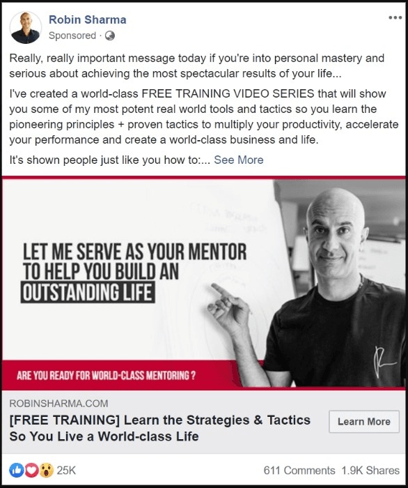
Robin Sharma’s ad media is vital to its ad campaign’s success. Let’s break it down: he used his picture, which plays an important role in engaging people. Most people who know about him and see the ad are likely to click and check out the offer.
Secondly, the copy on the ad media is the key to engagement. He went for a statement that offers to help people out, which does look quite interesting.
Thirdly, the design of the ad media is sophisticated. It’s appealing to the eye and attract the viewers to look at it. Sharma’s wearing a black shirt in the picture, which is why most of the ad design body is white-ish except for a bottom bar.
There is no doubt that it was a good design for a Facebook lead ad, which is intended to push people to take action.
Ad Text
Let’s look at the ad text of Robin Sharma’s ad. What fascinating thing is that this ad contains a whole heap of text at the top, but look at the first two lines that make all the difference.
The copy is so well written because it tells the reason in the first two lines that why you should pay attention to this ad. Later on, the next paragraphs explain the free video training program.
Another point to be noted is that they have written “free training video series” in capital letters in the copy, which grabs the attention of the audience.
Headline
Robin Sharma’s ad has a rather long headline which tells what this training series has to offer. The advertiser added the text “FREE TRAINING” in brackets in the headline, which stands out; it was quite a smart thing to do. It sends a signal to the viewer that it’s a free training program.
CTA
The CTA that was used in the ad was “Learn More,” which is just fine because it encourages people to find out more about this training series by clicking on the CTA button.
Takeaway: There is a lot to take away from this ad, for example, a good ad media, a suitable copy, impressive first two lines in the ad text, and an appealing headline. These were the substantial things that take this Facebook ad far above the average.
#5: Peng Joon
 Introduction
Peng Joon is a public speaker, author, and business coach. He has done training and sessions in over 20 countries around the world. He offers his training programs and live speaking services at social media and entrepreneurial events.
Ad Media
Peng Joon used a picture from one of his talks in the Facebook ad. It’s a smart way of conveying a silent message of what you do or what your profile is all about. He has done tremendously well with opting for the right picture for the ad.
Ad Text
Like most public speakers and trainers, he also tried to maximize the ad text portion of the Facebook ad. The first three lines explain that it’s a free training program, which might interest people. The rest of the text body explains why people should take this training.
Headline
The ad’s headline is smartly written. It starts off with a statement that reads “Exclusive Free Training,” which could interest people right away. The second half of the headline reveals that this training is about content creation.
CTA
The advertiser used the “Learn More” CTA for Peng Joon’s ad campaign, which is understandable. When most experts run Facebook ads of training programs, they use the call-to-action buttons like “Learn More” or “Sign Up.”
Takeaway: The best thing about this ad was the ad media; the picture says it all. It could even attract the audience that doesn’t know Peng at all. So they have done a good job of choosing the right picture for this lead ad.
#6: Nomatic
 Introduction
Nomatic is an online fashion accessories store from Utah, United States. It ships products across the globe. Their products include backpacks, wallets, and other accessories.
Ad Media
Nomatic used the video in their Facebook lead ad focusing on the backpack. The ad looks to focus on different properties of the backpack. When the video is used instead of an image, it’s a different story altogether because people decide about the product once they finish watching the ad video. Thus, the better the video, the higher the engagement.
Ad Text
They’ve done something exceptionally well with their ad text. They used the top text bar telling everyone that they’ve raised a huge investment of $2.9 million. These small punches in the copy always make a difference in shaping the image of the brand.
Headline
When it came to their headline, they did a bit of gamble, but it seems to be working in their favor. Look at the number of shares on the ad. They revealed in the headline that they’re getting positive reviews of their backpack product, which is fine considering the whole ad revolves around the very product.
CTA
Lastly, they chose the “Shop Now” CTA button because they’re an online store, and they’d like people to make their minds to purchase their backpacks. Hence, the call-to-action button is suitable for the ad.
Takeaway: This ad does stop users from scrolling because it’s a video ad, which tends people to watch it. Secondly, the ad displays a black backpack on a white background with a text on it that reads “the most functional travel pack ever,” which would entice people to watch the video ad.
#7: Gearbest
 Introduction
Gearbest is a popular online gadget and tech accessories store which ships products across the world.
Ad Media
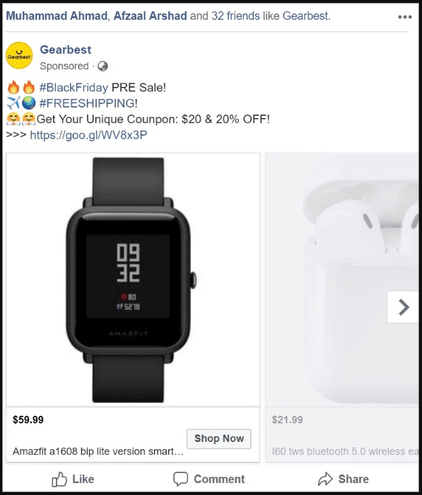
Gearbest chose a carousel ad campaign to promote its products. They did exactly what an online store would do; they used the pictures of their products to run the ad. In carousel ad, you can use multiple pictures along with their unique destination links to promote and engage the audience.
Ad Text
They used two hashtags #BlackFriday and #FreeShipping in the text. The ad text also hints that it’s a pre-sale offer. Moreover, there is a coupon code mentioned as well. It’s clear that they want people to click on the CTA button or the URL in the text to land visitors on their website. The difference between this ad text and the previous ones is that this ad text is a bit of clutter with a lot of information.
Headline
They went for mentioning prices in the headline section, whereas most advertisers try to add the names of the products and display prices in the URL description section.
CTA
Most carousel ads have “Shop Now” call-to-action buttons so it comes as no surprise that they used this CTA button.
Takeaway: There is no rocket science in running a carousel ad. You choose pictures of your products and display them. However, you should take away that they used transparent pictures of their products, which is huge in engaging people on social media. Moreover, try adding clear and high-quality pictures in the carousel ads.
#8: Diib
Introduction
Diib is a website analysis tool that provides growth tactics, traffic opportunities, competitors’ analysis, and keywords ideas to grow your business.
Ad Media
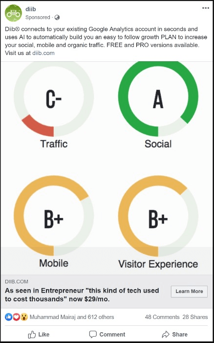
Diib has done pretty well with their ad design because it showcases four different web analytic elements such as traffic, social, mobile, and visitor experience. The design immediately triggers the idea that this tool has something to do with website analysis. So they have done quite well with the ad design.
Ad Text
They wrote a short paragraph in the ad text to explain what Diib does and how it works. It’s a good idea to clarify what your product does right away. A lot of brands make this mistake, they over-cook their branding and advertisements that make visitors walk away. Diib did the right thing with their ad text.
Headline
Those chose a rather long headline for their ad, but what they conveyed through a long ad headline might make help in gaining traction. They revealed that the Entrepreneur website talked about their tool. Plus, they’ve done something quite interesting in their headline; they didn’t mention the free version, but instead, they highlighted the price of the paid plan. Marvelous!
CTA
They used a common CTA “Learn More” which is fine.
Takeaway: There are a few things to learn from this Facebook ad. Pay attention to their ad design because it communicates and tells what this company does. Secondly, they boast a little bit about being mentioned in a big online publication and tell about their paid plan right away, which is smart.
#9: AppSumo
Introduction
AppSumo is a deals website that promotes digital software and subscriptions. The website is known for collaborating with software companies and digital entrepreneurs for providing huge discounts on the products for its subscribers.
Ad Media
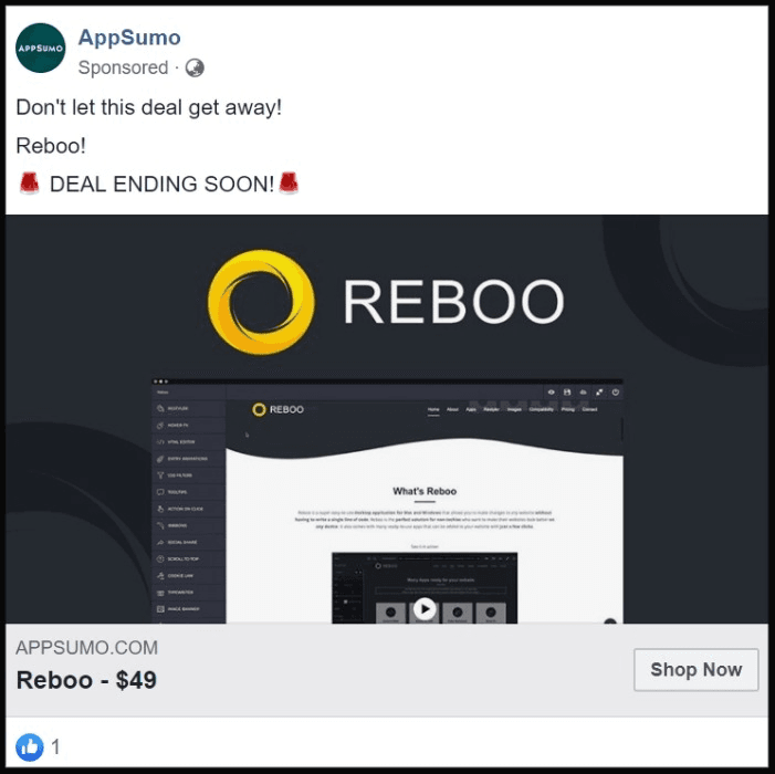
AppSumo used a picture/screenshot of the software Reboo in the ad design. Moreover, the ad design is based on Reboo’s branding. It showcases a glimpse of the tool in the design as well.
Ad Text
AppSumo did quite well with their ad text. They chose to write a short ad text. Plus, they highlighted that this deal is ending soon, which adds the urgency and excitement among the prospects. So they’ve done a good job with the ad text.
Headline
The headline is very precise; it says Reboo – $49. The good thing about this short headline is that it appeals to the viewers. Most people could ignore long statements in the headlines, but when there are a couple of words to read, such headlines get attention.
CTA
They used a “Shop Now” call-to-action button, which is understandable. The purpose of the ad is to push viewers to check out the deal and buy it.
Takeaway: The design was okay, but the ad text was fantastic. Moreover, the headline made all the difference; it was short and to-the-point.
#10: Airbnb
Introduction
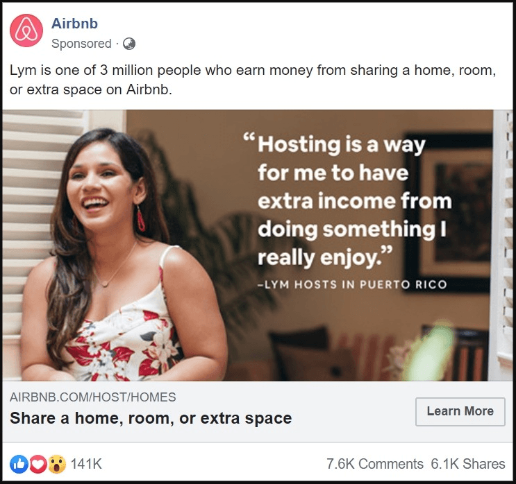
Airbnb is a hospitality service that allows people to book houses or rooms before even reaching their destination city or country. Similarly, it also creates money-making opportunities for real estate owners.
Ad Media
Airbnb used a picture of an Airbnb user, which means they have inducted a storyline to their ad. The ad design has a copy written on it which also explains the story.
Ad Text
Airbnb’s ad text is very simple, to-the-point, and understandable. It’s the testament of perfection and simplicity. Not only does it explain what Airbnb is, but it also shares a story.
Headline
The headline tells something a 9-year-old could also understand. They used simple wording to explain their business.
CTA
The “Learn More” does the rest of the job by taking the viewers to the certain landing page or the official website of Airbnb.
Takeaway: This ad teaches us that you have to be authentic, clear, and simple with your message. Fantastic!
#11: Aromahead Institute

Introduction
Aromahead Institute is an organization that offers courses on the therapeutic use of essential oils. They have certifications and online courses on the science of essential oils.
Ad Media
Aromahead used a picture of flowers, which represents nature, and the picture goes perfectly with their line of work. Moreover, the ad copy brings more clarity to the context. It tells that it’s a free training program on Aromatherapy.
Ad Text
They did write a rather long ad text, but the first line is always important. What they did right is that they chose to write a short, precise, and to-the-point first line, which is crucial to their ad’s success.
Headline
A lot of advertisers are aware of using some text in the brackets right before the headline to make it appealing. In Aromahead ad, they wrote “Free Class” which clearly attracts the audience. Furthermore, the remaining text in the headline tells about their training on essential oils.
CTA
They opted for “Sign Up” call-to-action button, which seems about right because they’re trying to get people to sign up for their training program.
Takeaway: They used a relevant picture, came up with the good ad text, and wrote a reasonable headline.
#12: Pure Origin
Introduction
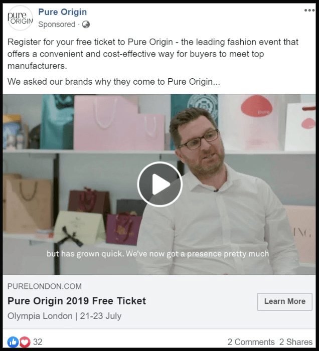
Pure Origin is a leading fashion event that connects buyers to manufacturers and designers in a convenient way.
Ad Media
They used a video ad which looks like a montage of different time-lapses and interviews to help people understand the event.
Ad Text
Pure Origin wrote a few lines in their ad text which pretty much clarify what Pure Origin is all about. Plus, they also mention the availability of free tickets in the text.
Headline
The ad’s headline focuses on the event’s free tickets and doesn’t say much. However, the presence of keyword “free” in the headline is going to make some difference in the response of this ad.
CTA
The “Learn More” CTA would be taking the visitors to the user registration or tickets page for further details.
Takeaway: The ad text was simple and meaningful which seems to overshadow its average-looking headline. Since the ad media was a video which gets the most attention in the ad, but still, the headline could have been better.
#13: Godaddy

GoDaddy
Introduction
Godaddy is a popular domain registration and web hosting service provider.
Ad Media
They chose a carousel ad for their Facebook lead ad. They used multiple 5-to-6 seconds of videos for their campaign.
Ad Text
The ad text does explain in a few lines that why you should go with Godaddy in the first place. They explained what they do and used the ad text to convince the audience why they should try Godaddy.
Headline
Each ad in the carousel has a unique image and headline.
CTA
Godaddy used the “Shop Now” CTA button which is understandable because they’re trying to make sales.
Takeaway: If you have multiple products like Godaddy has domains, hosting, SSL, dedicated servers and more to offer, you can use carousel ads to advertise them.
#14: Crello

Crello
Introduction
Crello is a famous online graphics designing tool for creating social media posts, blog images, and digital marketing content.
Ad Media
Crello came up with a great ad design. However, they specifically showcased the video templates feature of crello, whereas you can create ebook covers, social media posts, blog images, and much more using Crello. Let’s not forget the copy of the ad design which says, “animate your canvas” which hints what Crello could do more.
Ad Text
They mentioned 8,000+ templates, objects, and backgrounds in the ad text. It could attract the ad viewers to check this tool out.
Headline
The headline reads “your favorite video maker,” which shows that they are specifically targeting the audience who is interested in making short visuals and videos.
CTA
The “Sign Up” call-to-action is pushing viewers to go to the crello website and start using this tool.
Takeaway: It’s true that their ad design is fantastic. Not only does it attract the audience, but it also tells what this tool can do. Moreover, the copy did the rest of the job along with the ad design.
#15: SEMrush

SEMrush
Introduction
SEMrush is a popular keywords research, competitors’ analysis, and website SEO management tool. Now, they have come up with a free tool called SEO Writing Assistant that helps bloggers write better content.
Ad Media
SEMrush used a 30-second video for their lead ad to help guide the viewers about their new tool. The video tells what this online tool could do to your digital marketing and website copy.
Ad Text
SEMrush did a fantastic job with bullet points in their ad text. Usually, when advertisers have a large text to put into their ad text body, it starts to look boring and messy. On the other hand, SEMrush wrote the key points in bullets and made it look cool.
Headline
The headline is simple, meaningful, and understandable. This tool does help you in writing better content so they have clearly communicated that through the headline.
CTA
The “Learn More” CTA would take you to the page where you could get this tool.
Takeaway: The best thing about this Facebook ad is the bullet points. It changed the whole perspective of the ad. Moreover, the first line of the ad body text also explains what this tool is all about. Thumbs up to that!
Final Thoughts
These 15 Facebook lead ads examples were noticeable yet different from each other.
One of the things to remember about Facebook ads is that the experimentation would teach you what tutorials and examples might not.
I tried to pinpoint the key elements of a number of Facebook lead ads so that your next Facebook lead ad campaign could do wonders for you.
Some of you might be experts at Facebook ads so I’d love to read your opinions as well.
What else would you like to add to this article?


