Table of Contents
Best Designs for Different Verticals Using Simple Steps
At some point in our lives, we have all wanted to master Photoshop. Either to get those instant likes on Instagram or to simply make beautiful posters. However, Photoshop is a complex tool and requires proper understanding of its tools and features. Thankfully, there is now a great alternative available for free in the market called Canva. From thumbnails to advertisements, Canva’s got all the newbies covered!
Understanding Canva Tool
Before we dive into how this tool works, let us understand the various advantages it offers.
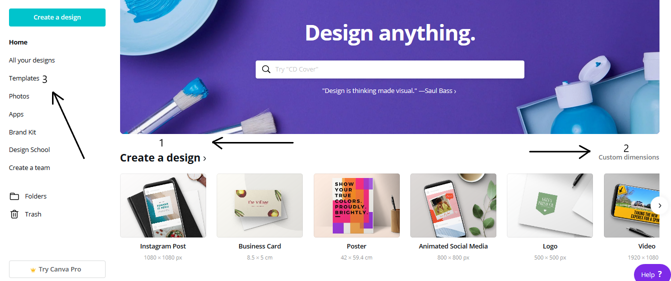
This is Homepage / Dashboard that is visible once you log into the website. In the picture above, we can find three markings that indicate the following.
- The ‘Create a Design’ option features a collection of canvas sizes, ranging from Instagram posts to Business Cards. Since most of them have default dimensions, it is easier for the user to choose the right canvas to work on.
- The ‘Custom Dimensions’ option is an advanced option that enables you to customize your canvas size. If you have a specific requirement with customized dimensions, you can enter the values in this option to create a canvas of the given dimensions.
- The ‘templates’ option features a variety of templates for users who are just beginning their designing journey. It hosts a collection of post templates for some of the most commonly used purposes (Promotional posts, Seasonal posts, Business cards for various Businesses, etc…)
Although, the Canva tool comes with plenty of other features, the options stated above are the ones required to design a social media creative or advertisement.

Now, let us choose the Instagram Post canvas, since this is an ideal ratio (1:1) that works well on all platforms. Once we select the canvas, the website directs us to this screen. On the Left – hand side, we have our toolbar containing all the designing tools. Even within the toolbar, we have the option of selecting our templates.
You may also like this: Canva Review: How to Design Great Ads & Creatives On Your Own For FREE
Idea 1: Themed Post
It’s Women’s day! and your organization is looking to design a Women’s Day themed ad for their social media profile. You want to capture the attention of all the women online (based on your target audience) and make them feel special and valued. Here is how you can design a very simple women’s day post for your brand.

On the toolbar, let us select templates. Doing so, we find a small white search bar right next to the toolbar. In the search bar, let us type in ‘Women’s Day Instagram Post’, since this search will also consider our canvas size. Canva will now display a list of templates for us to work on. We can select one that closely matches our brand.
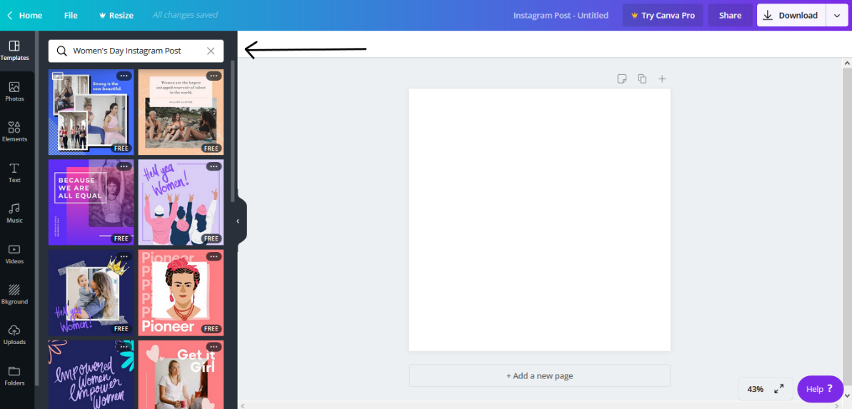
We are shown a number of templates associated with women’s day. Let us choose one that we like the best.
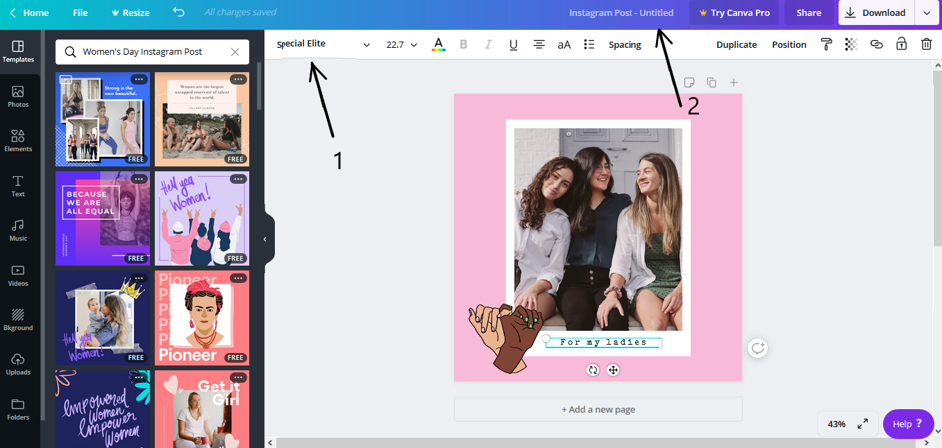
Let us consider the above template for reference. Here, 1 refers to the font settings. Let us choose a font that is more cursive to represent a hand marked polaroid picture. Hence, we first click on the text below the image and select the ‘Atma Light’ font from the drop – down list below. We can also change the font size, alignment, color and spacing with the help of the font settings.
2 refers to the name of the file. Canva lets us organize all our designs on the dashboard. Hence, you can name your designs to easily access them in future. This way, you can keep all your women’s day posts under one design file and use them annually.
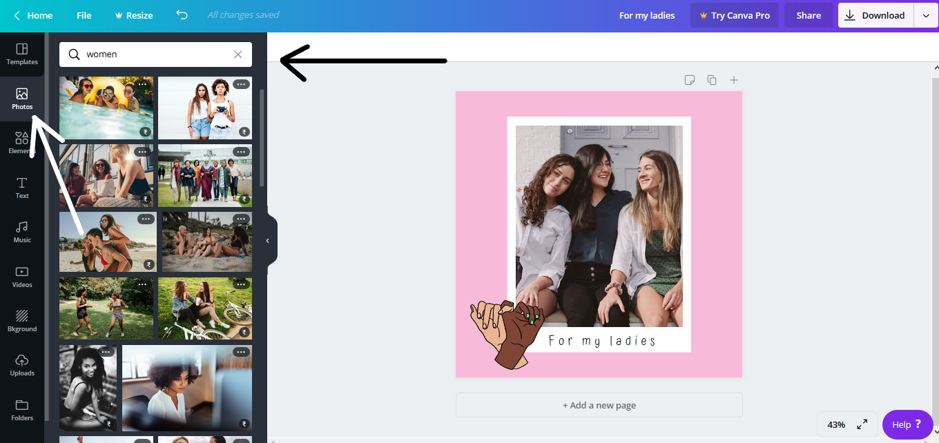
You can modify the existing template, to make it less obvious for your audience. To make it more customized, let us change the image in the template. Now, there are two options you can choose from.
- Either, you can choose to upload your own image (Ex. An image of the women at your organization). For this, select uploads from the side toolbar and upload your file. Then, click on the image to use it.
- Or, you can select a picture from Canva’s gallery if you do not have the desired image.
For the time – being, let us select a different image from the gallery. For this, go to Photos and type ‘women’ or ‘female’ in the search bar. Scroll through the images and find an image you like. Click on the image and size it according to the white rectangle box, to resemble a polaroid. To delete the previous existing image, click on the picture and press ‘Delete’ on the keyboard.
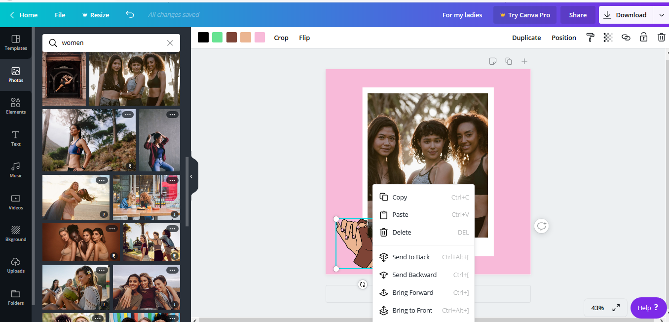
Once the new image is pasted, we find that the picture overlaps the ‘united hand’ sticker on the bottom – left corner. To bring the sticker to the top of the image, select the sticker and right – click on the mouse. Choose the ‘bring to front’ option to avoid overlapping.
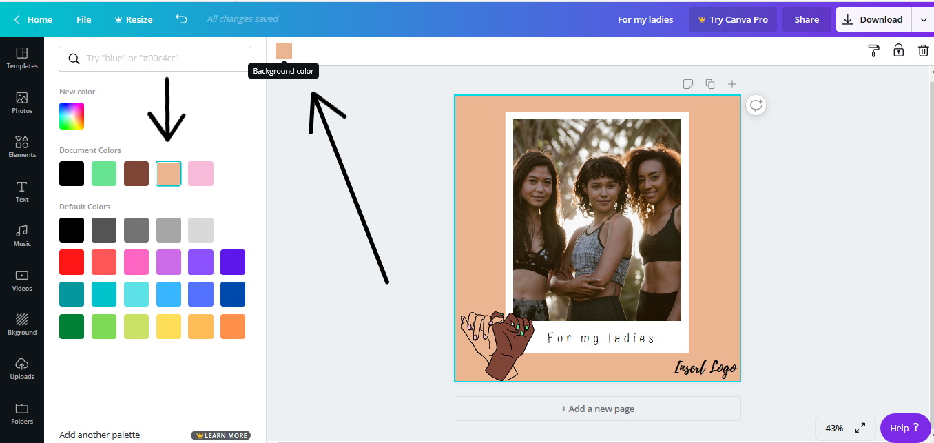
Since the bright pink in the background does not go well with the image chosen, let us change the background color. For this, click anywhere on the background and select the color in the upper tab. A new tab displaying all colors, appears on the left – hand side. Click on the color of your choice. Since the hand sticker is not contrasting enough, you can delete the sticker by selecting it and clicking ‘Delete’.

To make the picture stand out, let us move it to the side of the canvas. This will leave more room for any text that you may wish to add. To move the image without disturbing the formatting, click and drag the mouse cursor across the portion you wish to move, to select it. Then, slowly move it to the location of your choice. To insert text, choose ‘Text’ from the toolbar and draw a text box. Enter the text and choose the appropriate font style and size.
In the image above, 1 shows us how the text is placed next to the image. 2 shows how you can vary the color gradient by selecting ‘New color’ and moving the cursor across the palette. 3 shows us how you can save the file for later. You can also insert your logo at the bottom as a personalized signature.
This creative idea is a basic design, to help you understand how the fundamental features of Canva work. Now, let us have a look at another creative idea.
Idea 2: Promotional Post
You run a café that serves American and Italian Cuisine. You are looking to design ads to promote your best dishes. You want your ads to increase the number of footfalls and therefore, you run a promotional campaign.
The interesting part about advertising food brands is that, most of the talking is done by the picture itself. Using an appetizing image can appeal to your audience, making them super desperate to try your dishes. There are two creative ideas that you can consider.


In the first creative, you are advertising your famous Pizza. The post is simple, clean, neat and direct, with a stunning shot of your cheesy pizza. In the second creative, you are advertising your Children’s Day offer. By offering free fries, you are encouraging parents to bring their children to your café.
Since the process of designing the first creative is similar to the example discussed earlier, let us see how we can design a post that resembles the second creative, using Canva tool.
Firstly, select the picture you want to feature as the backdrop of your ad. You can choose from the Canva gallery or upload your own. Let us choose a custom image that we uploaded to Canva and resize it to fit the canvas.

Since we will overlay our text on top of the image, let us reduce its intensity to accentuate the text. There are two ways you can do this.
- Select the filter option from the top tool bar and try the different filters to see which one works best for your image. Since the image we have chosen is already on the duller side, using filters may not be the best option.

- You can also vary the transparency of the image using the option in the upper toolbar, to see which value is ideal.
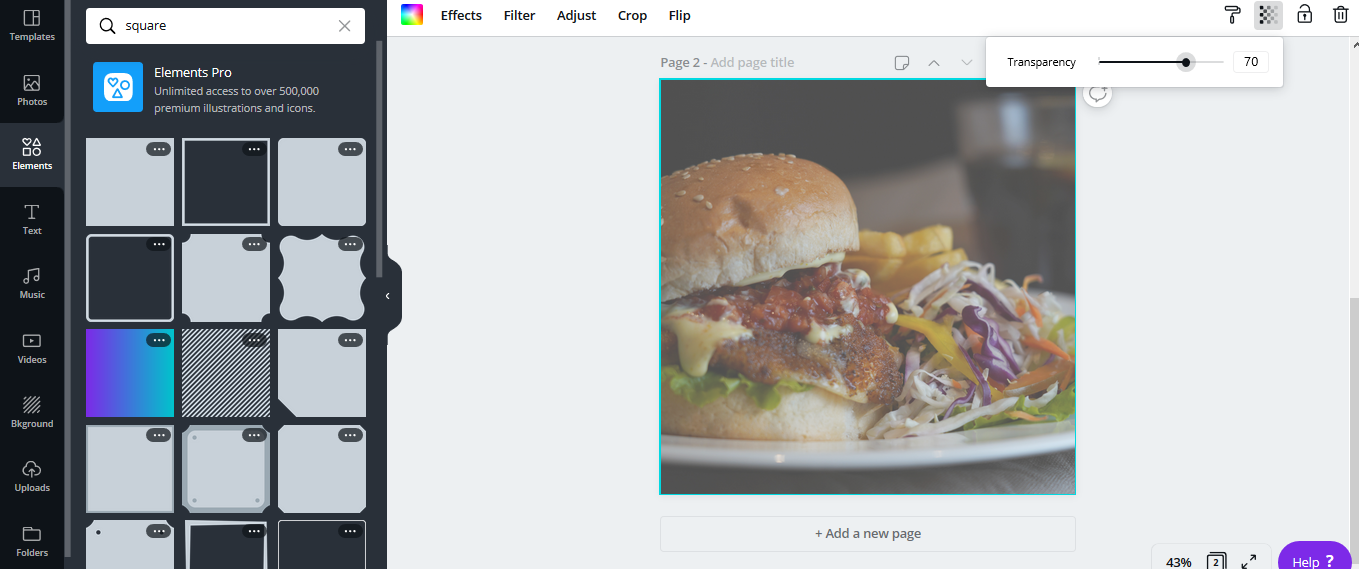
If you want to feature your food image as the prominent focus point, you also can use a separate block in the corner of the creative and use this as a text block. For this, you can search for square under the ‘Elements’ option and select one. You can then change its color and position it away from your focus point.

Here, let us try using a square block. We can also resize it and convert it into a rectangle. Now, let us change its color to black and vary its transparency by clicking on the block. Finally, you can lay your text on top of it, to make the text stand out.
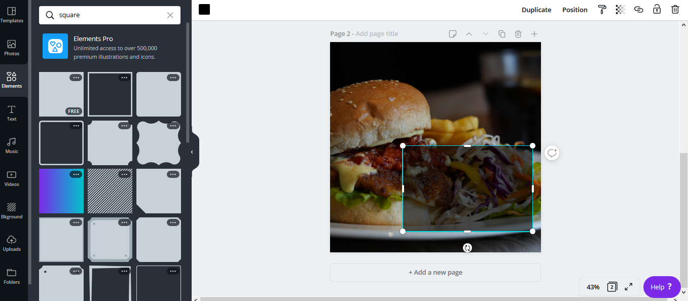
However, let us discuss this approach in another creative idea. For now, we are using the entire image as a backdrop, since it blends well with our chosen image. Hence, we will not use the square element option.

Going back to the earlier step, let us add the text once we have set the transparency of the image. For this, choose the ‘Text’ option from the side toolbar and select the relevant option. Let us choose the ‘Add a Subheading’ textbox.
Feel free to play around with the text formatting settings. You have the provision to change the color, text and spacing of the text. You can also bullet or align text.

In the upper tab, you also have the uppercase option where you can set the letters to CAPS by default. To tilt or rotate the text box, click on the text and place the cursor on the double arrow. Click on the arrow and move the cursor to rotate the text.

Once you have the text in place, you can border the text with a shape of your choice. Let us choose the circular border and change the color to white. For this, search for ‘circles’ under elements. Place the circle in the center and size it accordingly to fit the text. And Voila! We have a creative that is ready to go online.
Idea 3: Announcement Post
You are an artist and you are looking to conduct an Acrylic Painting Workshop for beginners. You are looking to design a creative that appeals to your audience and want your post to clearly convey all the details of the Workshop. The style you are looking for is professional and minimalistic, showcasing your expertise in training budding artists.
Let us select an image from the Canva gallery under ‘artist’ or ‘painter’. Choose an image that best represents your service. The picture chosen shows a woman painting enthusiastically, depicting the students of the workshop.
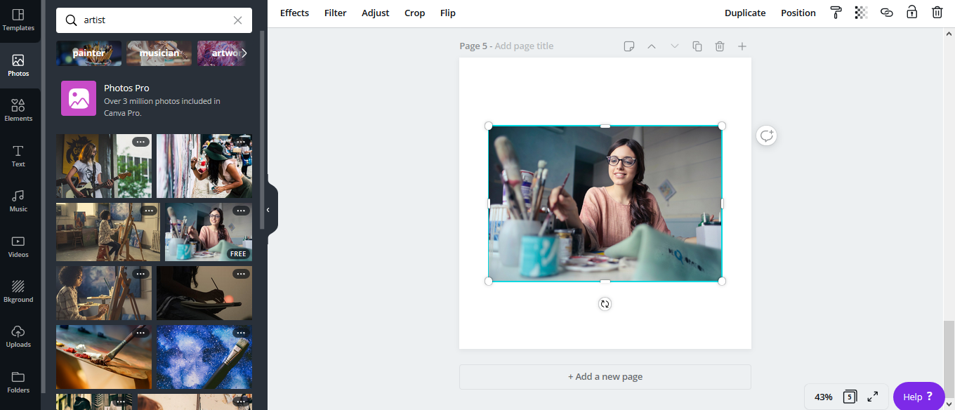
We find that the primary color tone of the image in light blue and grey. Using this as a base, let us cover 3/4th of the canvas with the image and choose a contrasting color block for the remaining portion.
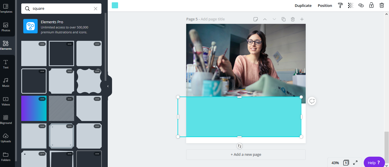
Using elements, let us select a square and try changing its colors. If you want multiple colors on the background, you can place multiple elements of different colors. Else, you can simply change the color of the background by clicking on the portion that is not covered by the picture.
Since the light blue is a little bright, let us try using the other primary shade, which is grey. Grey is a dull color and will blend well with the image. It will also have a professional and neat look.
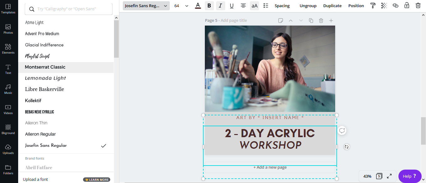
Using the ‘Add a Heading’ and ‘Add a Sub – heading’ textboxes, we can differentiate the texts by varying their sizes. This can bring more attention to the keyword ‘Workshop’.
As you can see in the above screenshot, we are juggling between different fonts and font styles to see which works best. You can also use the font combinations, which can be found in the ‘Text’ option.
Idea 4: ‘Offer’ or ‘Discount’ Post
You own a boutique that features a collection of amazing clothing brands. With Christmas and New Year right around the corner, this is the perfect time to advertise your “Christmas & New Year Sale”. You want to create an eye – catching creative, that brings all the Instagram users to your front door.
Let us search for ‘Fashion’ and find suitable images or upload an image of our choice.

Now, let’s assume you want to place the image on the left-hand side. The woman in the image is looking to her right. Positioning of images with respect to direction plays a very crucial role. Since we want the image on the left, the chosen picture needs to be flipped horizontally. For this, select the flip option from the top menu and choose ‘Flip Horizontally’.
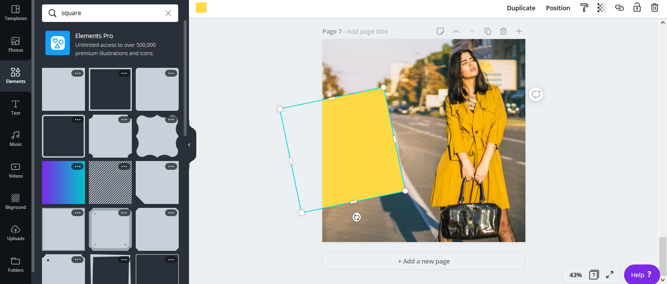
Here, we are featuring the Mustard – Yellow Cardigan Suit. To maintain uniformity in our creative, let us select a yellow square block (you can change the shade to match the dress). Tilt the square and resize it, so that it gives space for our headline.
Now, there are two things that you can consider doing in this creative.
- You can overlay your main headline directly over the yellow block. Or,
- You can bring in another element to add contrast to your creative.
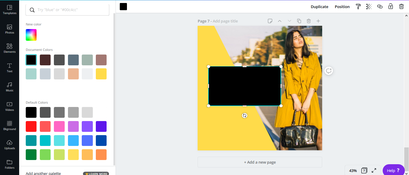
Since the woman in the creative is carrying a black bag, let us bring in another black element to contrast the mustard yellow
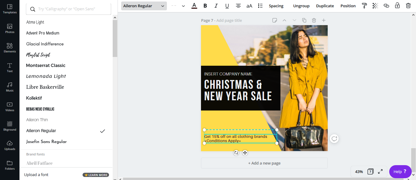
Now, let us add our main text and place it over the black box. The white text over the black box portrays a sense of style and class. If the black in the square is too intense, you can also consider reducing its transparency. If there is any supporting text that you wish to add (text away from spotlight), then you can add it outside the black element.
Another thing that you can add is a straight line as a detail element. This will divide the supporting text from the main text.
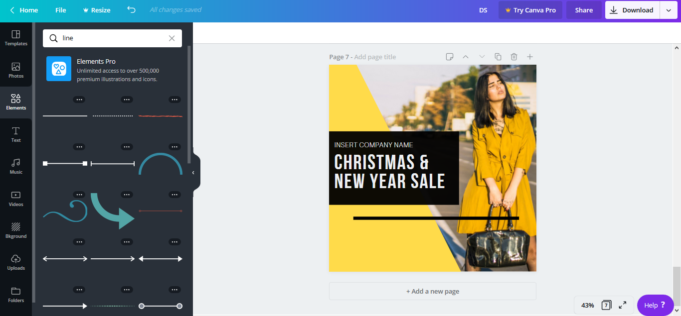
You can also change the color of the line, so that it remains light but is still noticeable.
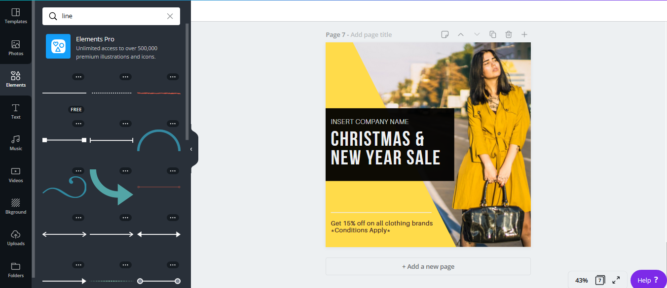
For the finishing touches, reposition all the elements used to see which positions work best. Place all the corresponding elements and try tilting, flipping and varying transparency to see what works.

Idea 5: Influencer Post
You are an influencer, motivational speaker and an advocate of Self – Care. You want to advertise some creatives that carry important words, which you believe will benefit your target audience. The creative could be a quote, advice, important facts and trivia, must do’s or anything that communicates your values.
Creatives like these require you to maintain a standardized template. However, using an image is not mandatory. Influencer posts must bring focus to the content that is being conveyed. So, the minimum contrast of colors it carries, the better.

Before we place our quote, let us choose a background for our creative. We can find this image of the night stars from the Canva gallery. This makes an excellent background for our quote. Once we align our image, let us work on the text layout.
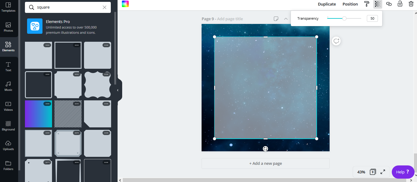
From the ‘Elements’ option, let us select a square and change its color to white. Since we do not want to completely eliminate a big chunk of the background, let us reduce its transparency by 50%. This ensures that the background is still visible, but not too much.
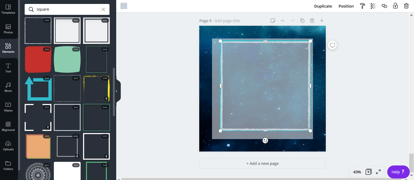
Next, let us add a border to bring focus to our text. This step is not necessary, but it adds detail by bringing the whole thing together. For this, scroll down through the square elements catalog to find different borders. Let us reduce the transparency of this as well, so that all the attention and focus go to the main text.

After resizing it, position the border with respect to the outer square. Then, we can add the text. Choose the ‘Add a Subheading’ option, to add the desired quote and text. Feel free to change the font style, size and color. Although, it is recommended to go with the same color as the border to maintain uniformity.

Finally, if the quote has an author or you wish to establish yourself as the owner of the content, you can add credits at the bottom of the text. For this, select ‘Add a little bit of body text’ option to add the author’s name. Try using a different font style for this, to differentiate the name from the highlighted text.
The work is done! a creative that does not use too many elements, but is still capturing enough. This is one of the simplest and most – effective creatives that you can design using Canva.
And there you have it! Five simple creative ideas for different verticals. Although these ideas may appear to be too simple and basic, they will still convey what you wish to communicate. For anybody who has no prior experience in designing or is just starting out, Canva can be a very helpful weapon. It is simply just click and drag, until you come up with hundreds of combinations. Initially, it can be a little tough to come up with an idea, but once you start practicing and working on the tool, you will become a design guru in no time!
So, create your account and start designing right away! Because, there are a million others out there, waiting to steal your spotlight.


